Whisky Labels and Packaging
I recently found myself in a discussion about labels and packaging. The discussion was actually so much fun, that I decided to share the insights I've gotten since then and share it with you.
Yes, I know, I know...
Let's get to the topic that's the least fun first. Because if I don't, while reading this whole blog you will say: "But you know it's all marketing, right?"
Yes. It's all marketing.
Yes. It's all about branding.
I know.
But as someone who professionally works in a business to establish a certain brand experience for the customers, I might spend some extra attention to the way brands visually present their products.
I can truly appreciate the beautiful designs that hold a meaning, and with that, a certain promise that brands make to their buyers.
So, back to the journey: For me it did not start with whisky.
For me it started with wine.
The French connection
I was born in a family of wine lovers. What I have with whisky, my parents have with wine.
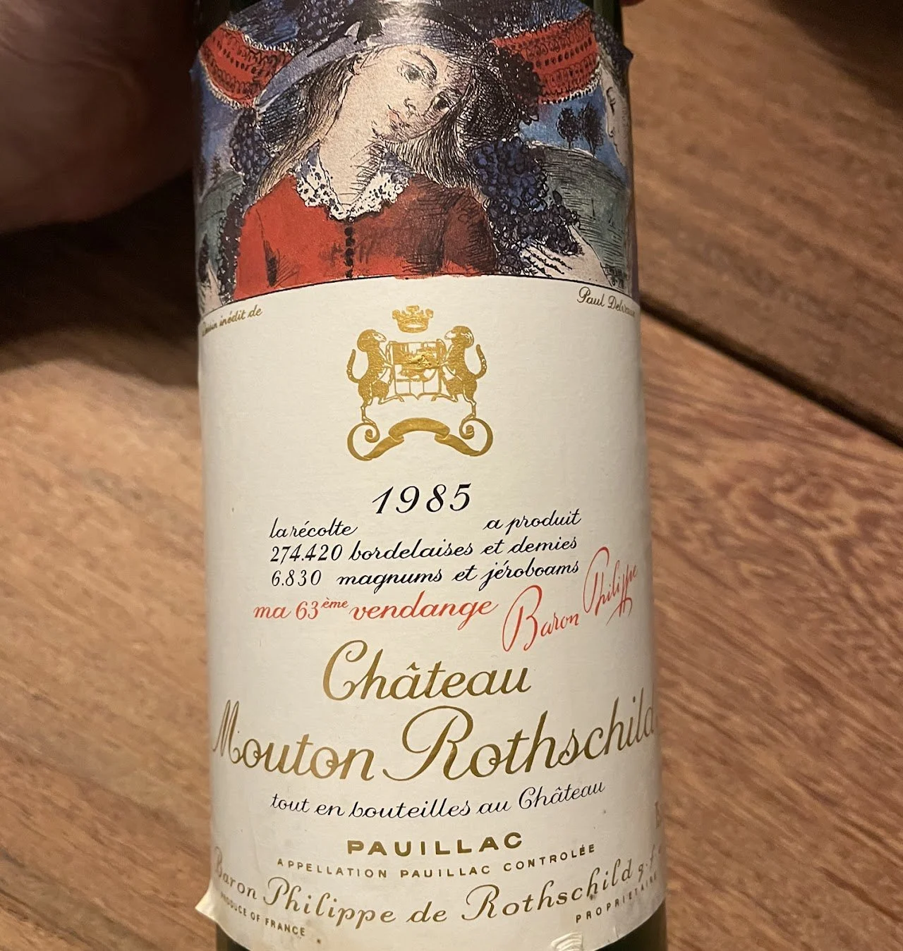
As an investment, my father purchased a case of Château Mouton Rothschild 1985. (Yes, now you know my age.) The French, don't like change. Therefore, the labels on wine tended to be a bit old fashioned back in the '80s. (And today still I think.) But some brands did fun things with the label. As is the case with Château Mouton Rothschild. Every year another artists work was placed on the label. In 1985 it was Paul Delvaux.
I've always loved that label and I still keep an empty bottle in my home office. For me, it is art. And I think that was the original idea: Combining arts: Painting and creating a beautiful drink.
Attracting attention
By the time I was, according to societies standards, all grown up, I had formed my own interest in a drink. To some great disappointment of my parents, not in wine, but in whisky. And at first, when discovering my first drams, I went for what was described as good whisky: Famous brands.
So exploring the standard range and line-up in big chain liquor stores, I was looking for a name. Not so much anything else. Being a poor student, I also tended to buy "simple and cheap" whisky. Which also had simple labels: Tartan design, bagpipe player, scotch bonnet etc. All playing on the Scottish part of whisky.
But when I had tasted the main line-ups, I started to explore outside the big chain liquor stores and encountered a whole world of different labels, bottles and boxings.
Legal labels
Now before I go into the wide range of labels and packaging different brands and/or bottlers have, first some information. In this article, I'm mainly talking about Scotch whisky. And by UK law, a label does have some requirements.
In section 8 of the 2009 Scotch Whisky regulations, it basically states that a label, on the front of the bottle, should contain at least the category of whisky in that bottle: (i.e. Single malt, single grain, blended malt, blended whisky)
Other things you will find (or should find) is the alcohol by volume, sometimes the region in Scotland it originates from and an age statement or a distillation and bottling date.
More often the type of cask(s) used to produce the whisky are also mentioned, either for aging or finishing the whisky. Or even on a blend, for "marrying" the whisky.
The label is basically carrying most information you need, sometimes even tastingnotes and paring advise!
Does the label tell you if it is good whisky?
No. Simply no.
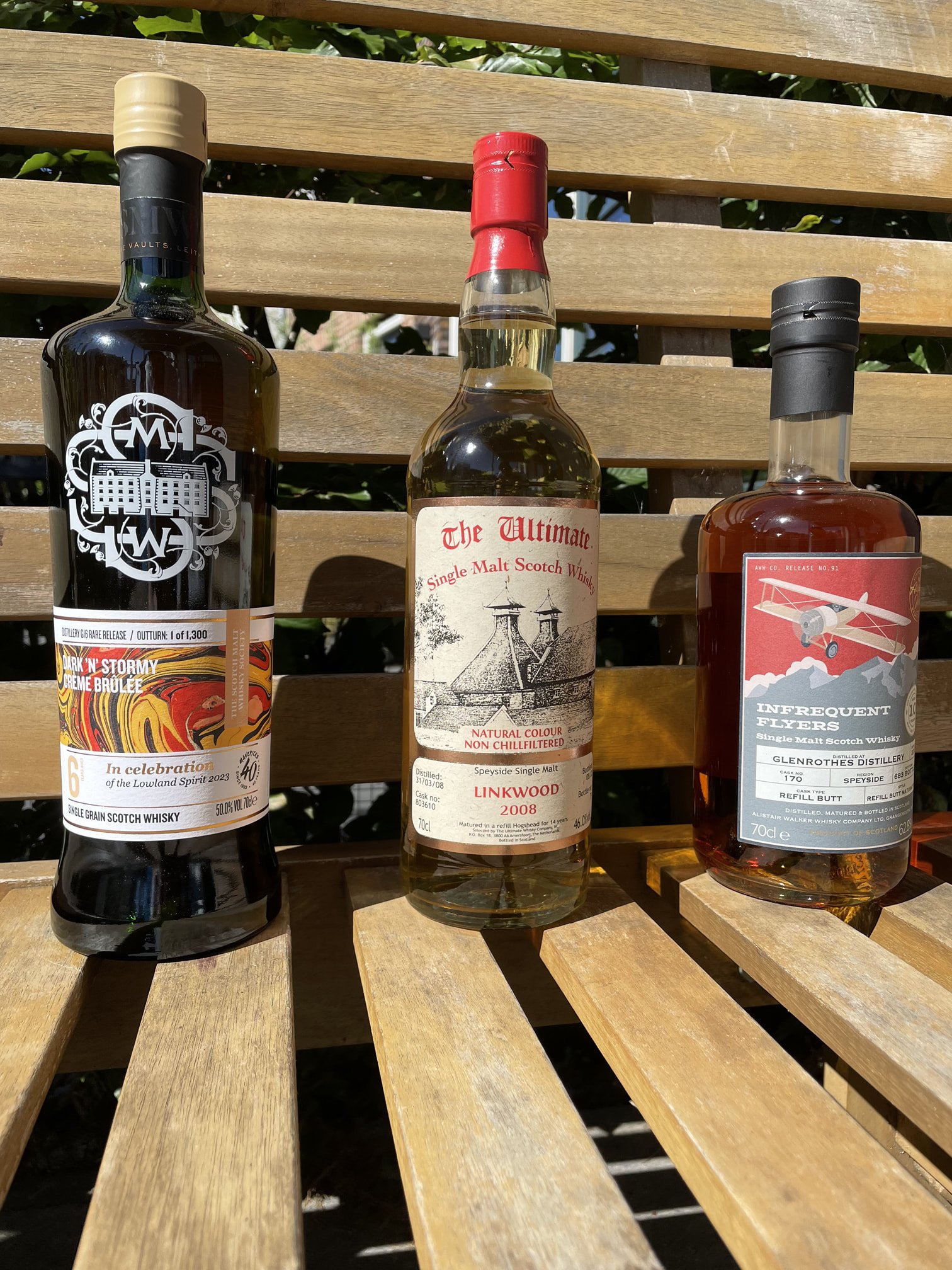
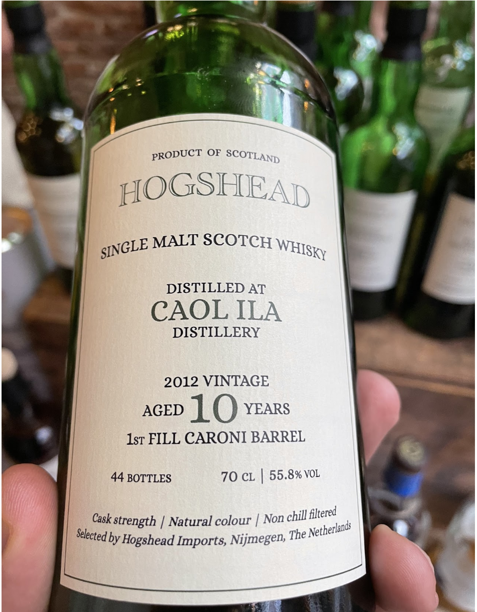
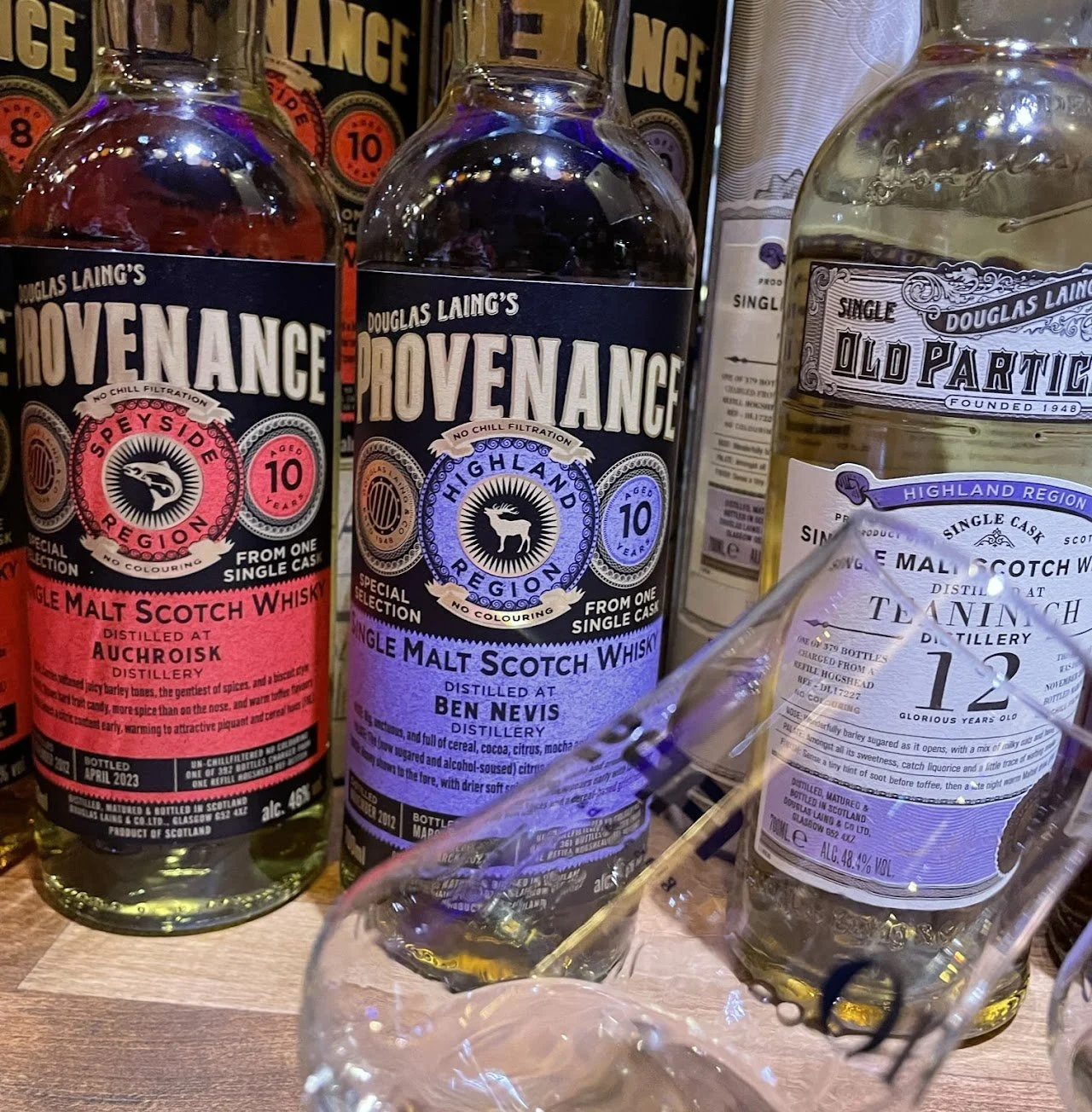
It is all a matter of taste, in label style and in whisky flavor. Personally, I like different types of designs. I like the very sleek and clear designs of the labels on the bottles of Hogshead whisky. I like that is is a simple design, gives me all the information I need and, in its simplicity, attracts attention between all colorfull labels.
I also like the batch designs some editions of the SMWS have, like the Dunnage Nougat. Colorful design adding a sense of specialty to that bottle.
(I also really like the logo on the bottles of the SMWS, which clearly states it as being a club bottle, and standing out in any collection.)
Would I buy a bottle for it's design?
To be honest, I did. Twice at least.
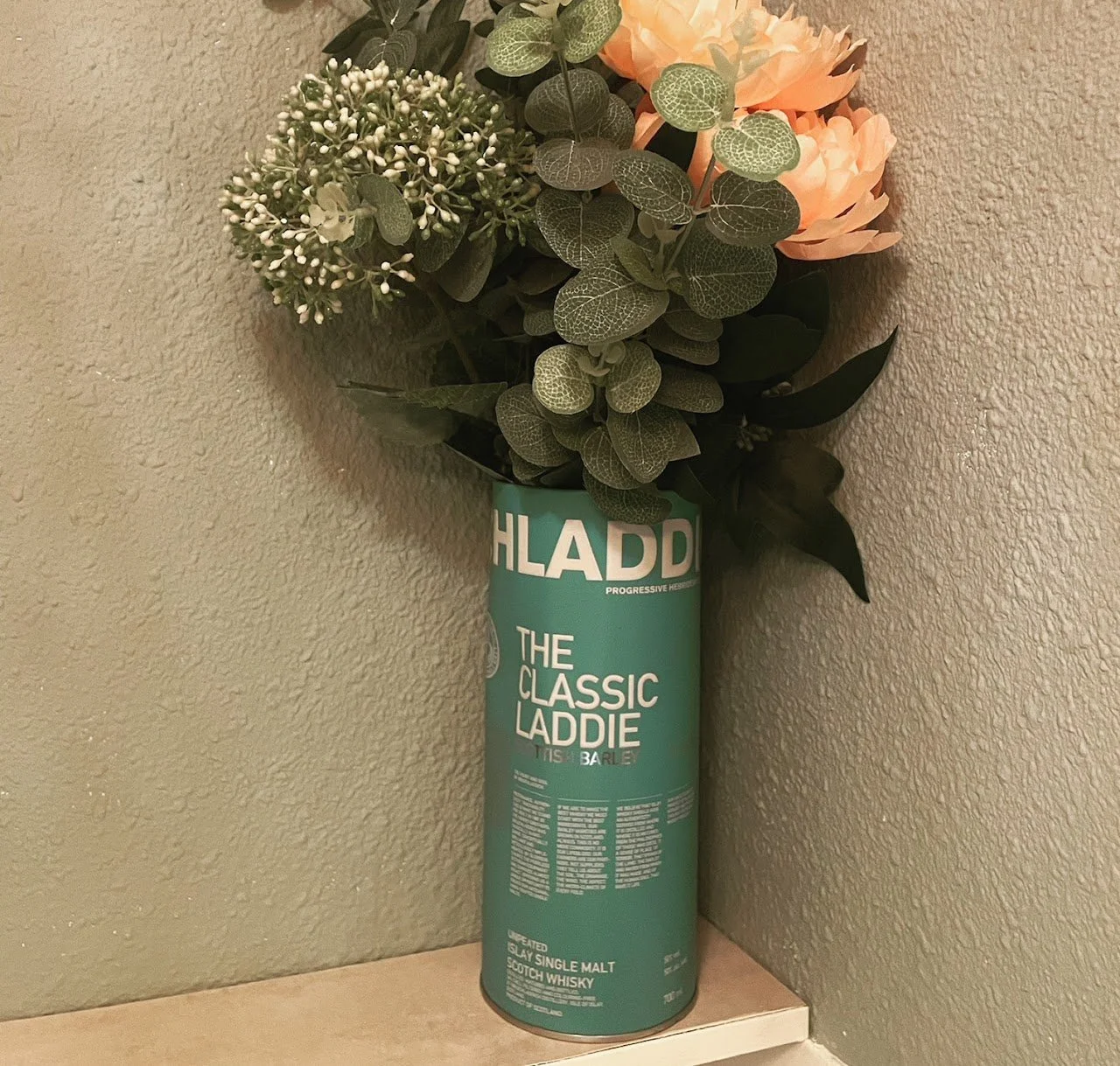
One example is the bright azure blue bottle (and packaging tin) of the Bruichladdich Classic Laddie. It stand alone in a crowd of bottles, and lucky for me, contains a perfectly fine dram that I enjoy so much.
The second time was the bottle of Mr. Peat, which had an awesome cartoon style label and packaging. Again, I was lucky and enjoyed the dram.
Packaging and bottles
More and more brands will use packaging and even the bottle shapes for branding purposes. Bruichladdich redesigned their bottle shape, and so did Glenglassaugh.
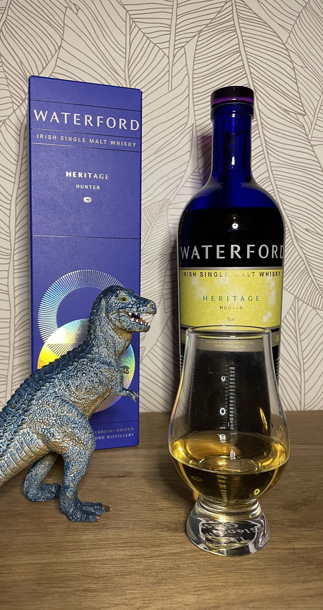
Others work with bottle colors. Like the blue bottles from Waterford, or the brown glass from the Holyrood Distilleries "Arrival".
All representing something the brand holds dear. At Bruichladdich it was sustainability. Glenglassaugh wanted to get the waves in the design of the bottles, Holyrood distilleries origins was a beer brewery and the brown bottles needed to be in the style of beer bottles. All the packaging connects to a value or story.
Should you buy because of the packaging?
Again, no.
The color of the label does not always match the flavor of the whisky.
But there is no denying that flashing colours or innovative designs attract a certain attention. Just like a flashy car or neon light attract our attention.
However, if you know how to read a label, and I hope I shared some information with you to do so, you might be able to select a whisky to your liking. And, by any luck, that whisky also happens to have a packaging or labelling you like, and might even perceive as art, you have something you like to drink and to look at.
It is the same as with the French wine: Art placed on art.